Blipzkrieg Postmortem
Game development has been a hobby for years, but Blipzkrieg is the first real game that I’ve done – one that wasn’t made in a weekend, and actually has a full, playable experience. My co-workers here at GameClay have been in the industry for a while, but this was a first for me. I learned a ton from working on the game, and thought I should write a post-mortem while it’s all fresh in my mind.
Prototyping

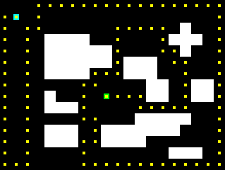
Early pathfinding wasn't exactly... efficient.
Blipzkrieg started as a very different game than it is today. The initial concept was a reverse tower defense game with an island theme. We thought we wanted to start with Flash, and take it to iPad afterwards.
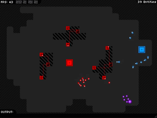
In the first version, you created spawn points, and your units pathed to the heart of the enemy base. Your goal was to find the safest paths for your attackers. When we found that boring, Mark suggested adding flocking. Soon we had little troops wandering around the game.
The troops did what they were supposed to, but were fairly stupid. We considered making them smarter, but realized that watching them wander to their doom was more entertaining. In fact, we had real trouble finding a way to make it into a game instead of a flocking simulation. It was neat to watch guys wander around the level, but it wasn’t playable.
Adding leaders was a huge help. Now the player had a presence, and a direct influence on the troops. Early versions had the player controlling multiple leaders, with different effects. One leader made troops better at attacking, another tossed troops in a direction, and so forth.
Unfortunately, we found multiple leaders to be unwieldy. Players tended to move one somewhere and then just leave him there. They became stationary troop influencers, and the player lost that sense of presence in the world. We decided to limit the player to one leader, which solved that.
Something still didn’t feel right, but we weren’t quite sure what. The game felt too slow somehow. We spent quite a while trying to figure out what was wrong, until Mark made the magic tweak and drastically increased the damage on the laser towers. Before, lasers had to fire on a single unit for a few seconds to kill him. Now your forces could be decimated in the same amount of time. It was the change we needed: the towers became absolutely terrifying, and your job as a leader became more important.
The gameplay never really changed after this point. The rest of development was spent on building levels (which I talk about below), and polish polish polish.
What went right?
I find looking at what went wrong far more useful, but there were a number of things that definitely helped us:
- Mark made the programmer art beautiful. God, the first prototype of the game was awful looking. But then Mark got his hands on it, and somehow managed to distill the look and feel into something beautiful. I am completely jealous of his skills.
- FlashPunk was awesome for prototyping. It does a great job at getting out of your way, and works with you instead of against you. It also doesn’t make any assumptions about the type of game you want to make.
- Flocking and steering did wonderful things for us. You can create some really unique behavior with just a few simple algorithms.
- We added components and signals to FlashPunk. This was really helpful for creating reusable behaviors that we could share between many entities. You can find an implementation of this in my FlashPunk fork.
- Dynamically loading assets allowed us to tweak without recompiling. I blogged about the way we loaded embedded assets at runtime on my coding blog. This was a huge time saver while polishing and building maps.
What went wrong?
1. Level Design Problems
Once we were done prototyping gameplay, War is Heck (level 24 in the finished game) was our only level. We were happy with it: it was hard, but fun, and we kept finding different ways to beat it. But when we tried to replicate that experience with more levels, we ran into problems…
It was at this point that we realized that none of us had much experience with level design. Oops. Worse yet, we couldn’t find many other games that played like ours to learn from.
This was by far the most painful part of building this game, and by far the most educating. It came down to brute force it: one of us would churn out as many horrible levels as we could, and the others would play and try to get ideas from them. We would get one or two good levels out of it, then repeat the process ad nauseam. We ended up with 35 levels or so that we were happy with, but the process was an utter grind.
One of the reasons this was so difficult was our lack of a real narrative in the game. We had an internal picture of the world, and who the player was, but we didn’t directly tell that story to the player. The art is also very abstract, which we love, but which made it hard for us to communicate some of these things to players. By the time we realized that was a problem, we were too deep into development to really change direction.
2. Time to Fun Problems
In early versions of the game, the learning curve was very steep. We added a number of tutorial levels to help this. That took the game a bit too far in the other direction: players got bored in the early levels, and never got to the fun ones later on. We cut a bunch of levels, and tweaked the early ones to teach faster, which seemed to fix it.
However, it seems like we didn’t go quite far enough. There is a steep falloff in player retention at a specific point in our early levels. This is reflected in some of the comments by confused players who think the game is just about running away from things. We lose their interest at that point and they don’t come back.
Mark had the idea of merging the tutorials into a single bootcamp level, and I do think that would fix this problem. However, we didn’t think about that until we were up for bidding on FGL. It was far too late to be making such drastic changes.
3. Control Problems
We knew from the start that we wanted to take the game to iOS, and this heavily influenced our decisions on controls. We made a conscious decision to use the mouse for input, and try not to use any keyboard input at all, so the game could translate directly to a touch device.
In hindsight, this was probably a bad idea. The gameplay is being altered for iOS anyway, and the input method (while novel) is a bit clunky on trackpads and on some of the levels that require fine control. I would like to try keyboard controls in a future version.
4. Collision Detection Problems
We used FlashPunk to build the game. I absolutely love FlashPunk, and remain happy with that choice. That said, we ran into big performance issues with the collision detection. FlashPunk doesn’t have a broadphase or any spatial partitioning. When you’re doing neighbor lookups for flocking and steering, things can get expensive really quickly. It also doesn’t have a raycast, which was a must for us.
We ended up rewriting much of the collision ourselves. I tried a quad-tree first, but the recursion cost for querying the tree was too high. In the end, I used a uniform grid, which fit our world well: we already used tiles, and the entities are all smaller than the tiles. Uniform grids also work very well for raycasts.
We also ported our customized FlashPunk into HaXe so that we could inline many of the function calls. This was a huge performance boost for us. I made the mistake of not searching around first, and didn’t find Matt Tuttle’s HaxePunk until after I had ported everything (doh). I’d definitely recommend looking at his port if you need to squeeze some performance out of your FlashPunk game.
I should say that we also looked at using NAPE: it was super fast, but the physics in our game were very touchy, as the flocking behavior is all balanced around it. As a result, it wasn’t really feasible for us to replace FlashPunk’s physics with NAPE so late in the game.
Learning from the experience
In the end, I’m very happy with what we have. I think we could have built it faster if we hadn’t run into the level design block, but I think we’ll do better with that in the future. Iteration seems to be the key there. Iteration, and lots of tears.
We could have done more, but we wanted to get the game out there and see what people thought of the idea. The feedback has been great. Some problems we suspected have been confirmed, and we’ve found others we didn’t realize. People seem to like the gameplay overall, and it sounds like they want more.
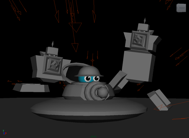
We’re working on porting the game to Unity for the iOS version now. We had to cut lots of ideas to get the Flash version done, and I hope we can work these back into the mobile version. Mark is doing all new art for the game, and it’s beautiful. I’ll leave you with a very, very early preview of what’s to come:


